

I hope everyone had a fantastic Easter! It’s Monday and that means it’s time for a new Simon Says Stamp challenge.
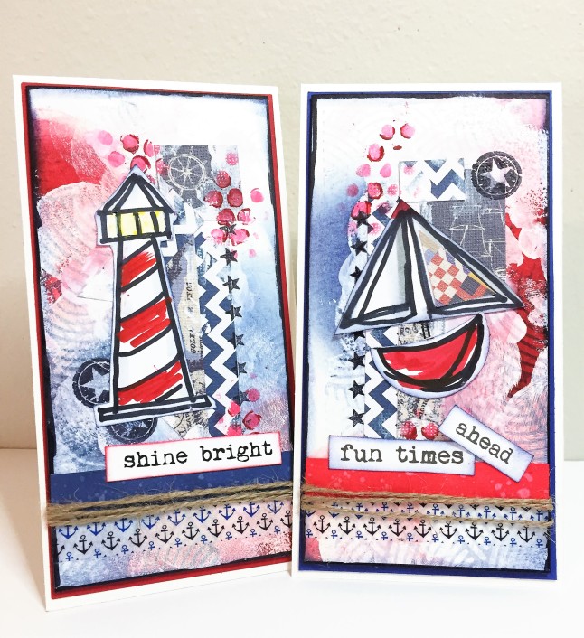
This week’s theme is Splash, and I can’t wait for a summer of boating and water fun, so, my first thought was nautical. I don’t really have many nautical-themed stamps; however, so I focused on a color scheme of red, white and navy and just let it develop. Here’s a picture of the end result.
Backgrounds
For the backgrounds, I stamped the Hero Arts Wave Background (my one nautical-esque stamp) with Hero Arts Ombré Ink in Pool to Navy on white watercolor paper. I pretty much botched the first impression, so I just went for it and did some 2nd and 3rd generation stamps in a wonky fashion. The picture below (top left) shows just how bad things looked at the start! You basically have to just force yourself to keep going at this point. After that, I smeared some Dylusions white paint on top with a palette knife and my fingers, then once dry, added some Distress Candied Apple and Chipped Sapphire ink with a blending tool. The picture top right, below, shows you the background at this stage. Hot mess, right?

Next, I cut the paper down to two 6×3 panels, added some navy colored scrap paper (see the end of this post for how I store scrap paper), and smeared on a bit more white paint with my fingers (see image above, lower left). Whew, it’s looking better already.
I used a the Tim Holtz Bubble layering stencil and a Distress Crayon to add some red dots. And, I also stamped a few stars using the Tim Holtz Bitty Grunge and Simon Says Stamp Seeing Stars stamp sets. I finished off the background with some nautical-themed washi tape and a smear of Chipped Sapphire Distress Ink and Black Sharpie around the panel edges (lower right image, above).
Focal Images and Finishing Touches
I decided to sketch some nautical images for the focal points. The abstract-y (is that a word?) sailboat was made by punching a 1 1/2 inch circle out of white card stock and cutting it in half. I also hand cut a triangle shape, then used a sharpie to sketch an outline. I used a Faber Castell big brush marker to color in the boat, grey Copic markers to add in some shading, and I added a piece of scrap paper to the sail. The lighthouse was just a free hand sketch made with a Sharpie, colored with FC big brush markers and grey Copics.
I printed the sentiments on my inkjet printer using a font called My Underwood, which is now my new favorite free font! I inked up a scrap of white card stock with Candied Apple and Chipped Sapphire Distress Ink as an accent for the sentiments, and also inked the edges of the sentiment strips.
The last steps were to add twine to the base of the panels and to back them with coordinating red and navy card stock before adding the panels to the card bases.
Ready to set sail!


Win a $50 Voucher to the SSS Store!

Thanks for stopping by! Don’t forget to link your Splash creation to this week’s challenge. You could win a $50 voucher to the Simon Says Stamp store. Can’t wait to see what YOU make.
Supplies
Here’s a list of the supplies I used for this tag:
- Strathmore Watercolor Paper (front panels)
- Hero Arts Wave Pattern Background stamp
- Simon Says Stamp Seeing Stars stamp set
- Tim Holtz Bitty Grunge stamp set
- Tim Holtz Bubbles layering stencil
- Hero Arts Ombre Ink in Pool to Navy
- Dylusions Paint in White Linen
- Distress Inks: Candied Apple, Chipped Sapphire
- Distress Crayon: Festive Berries
- Ranger Archival Ink in Jet Black
- Faber-Castell Big Brush Pens in Scarlet and Cadmium Yellow
- Copic Markers: C1, C4
- Twine
- Neenah Solar White Cardstock (base), navy and red cardstock (accents)
- Iris 4×6 photo boxes
Scrap Paper Storage
I’ve learned so much from you ladies about how you store all your supplies – and it has helped me immensely. But, scrap paper is my Achilles heel, so I thought I’d share a bit about my storage solution. I had a couple of shoeboxes FULL of scrap paper that I couldn’t bear to throw out. No organization whatsoever, just dumped in there – impossible to use, really. I admit it – I’m a scrap hoarder.
I needed to 1) organize the scraps so I could use them and 2) limit myself to what could fit in my space. I bought a few 4×6 photo storage boxes because they would fit in the drawer I had alloted and because they seemed to hold just the right amount – not so much that you can’t dump it out on the desk and quickly pick out a few choice pieces, but not so little that it’s not worth the effort. I labeled them by color family, which I found works better for me than by theme. See my stash in the picture, below. It’s been working great so far. And, I am DETERMINED that I won’t exceed the box for that color – so if it won’t fit, I must purge!! Hope this helps you tame your own scrap demons!


Wow, Amy, I love the backgrounds on your ATC’s. They’re stunning! Great organizational tip too. I’m currently going through my craft room and reorganizing when I have time. I love this tip on saving scrap pieces and I’m so going to use it.
Cathie ♥
LikeLike
These cards are so gorgeous Amy! I love the wonderful background you created as well as the stunning focal images. And that scrap paper organisation looks great!
LikeLike
This is fantastic!!! Amy, I love your style! Zoey
LikeLike
Oh yeah, messy but so pretty! Lve the bues and reds and the maritime theme. Hugs, Marzena.
LikeLike
Fabulous cards Amy, I love the nautical look and the backgrounds are awesome! The boat and lighthouse are fantastic too!! LOVE them 😍❤️
Luv
Lols x x x
LikeLike
wonderful nautical and patriotic cards!
LikeLike
Gorgeous nautical cards! I love the color combo! 🙂
*mwah*
Steph
Simon Says Stamp!
LikeLike
Both cards are fabulous, Amy. Love the beautiful background you created. The color scheme is fantastic! 🙂
LikeLike
These are great, Amy! Love the wonderful mixed media backgrounds and those awesome graphic designs. The red white and blue totally fit the nautical theme! hugs, Maura
LikeLike
What fabulous cards and I adore the backgrounds you’ve created they are wonderful and fit perfectly with the theme and with your wonderful nautical projects! Hugs… 🙂
LikeLike
love your fun bright and cheerful nautical cards Amy…great backgrounds and hand drawn images…hugs kath xxx
LikeLike
Great work! love this palette and the whole design of your cards is absolutely perfect! barbara
LikeLike